 Fact sheets are meant to be clear, visual, and fast to understand. A strong layout helps your readers get the info they need quickly without hunting through a wall of text. No one loves a wall of text!
1. Use Clear Headings to Guide the Reader
Headings break up your content and help readers skim. Use a larger font or bold style to make them stand out. Be consistent in how you style them.
Example:
✔ Good Heading: Common Symptoms of Lyme Disease
✘ Not-so-great: Some things that might happen
2. Keep Paragraphs Short (1–3 Sentences)
Large blocks of text make readers zone out. Keep your paragraphs brief and focused. Use bullet points when possible to make lists easier to scan.
- Use short, active sentences.
- Highlight only the most important info.
- Cut fluff words. Be direct.
3. Use Visual Elements to Break Things Up
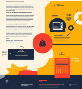
Icons, images, or shapes can help divide sections and highlight key points, as shown in the image below. Just don’t overdo it—aim for clarity, not decoration.

4. Leave White Space
White space (or negative space) isn’t wasted. It gives your reader’s brain a break. Add extra space between sections and around visuals.
Try This: After you lay out your fact sheet, take a step back and look at the whole page. Does anything feel cramped? If so, add some breathing room.
5. Align Things Carefully
Neat alignment makes your work look professional. Make sure your headings, bullet points, and images line up cleanly with the page margins or grid lines.
6. Use a Simple Color Palette
Stick to 2–3 colors, max. Use one for headings, one for accents, and one for background highlights (if needed). Too many colors = visual chaos.